
Responsive Web Design
Web Designing Company
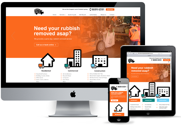
w3linker is a Responsive Web design company in Chennai provides high quality mobile responsive application for your business. It is the best option to convert your mobile visitor in buying customer. Latest study shows mobile and tablet users increasing compare than desktop user. Our easy to navigate fast loading speed will get you more visitors and revenue. Responsive sites are more engaged than desktop version to lead generation and increasing traffic.
Why Responsive Web Design ?
Super Flexible
Responsive web designs are like fluids which move easily in all screen sizes and resolutions; Both the grids and images adapt with the screen by retaining its original quality. Just as a liquid spreads out or draws in to allow its content to fill an allotted space and retain its appearance, responsive web design's fluidity achieves the same result with website content on a device screen.
Excellent User Experience
While, content is king and discover ability of content are foremost success metrics, it is the user experience that enables visitors to consume content on any website through the device of their choice and preference, anytime. Thus, responsive web design is about providing the optimal user experience irrespective of whether they use a desktop computer, a smartphone, a tablet or a smart-TV. Responsive web design accommodates the busy professional during the day and the wide-awake college student needing access to your site anytime. No scrolling or resizing is needed for any visitor to access your website from their favorite device.
An Increase in Mobile Traffic
Statistics show that in the last quarter of 2017, nearly 52% of all global web traffic originated from mobile devices. That accounts for more than half of all Internet traffic and goes to show that you cannot afford to forego responsive web design. Start by investigating how many of your visitors come from mobile devices and the time they spend on your site. Then, implement responsive design and compare the two numbers. Once your website adapts to the viewport width, you’ll notice an increase in mobile visits and longer time on site by those same visitors.
Search Engine Friendly
All popular search engine ranks the mobile-friendly websites in the top ten positions than the other sites. It is highly recommended that a responsive web deisgn configured for all mobile phones and devices is recognized as the best industrial practice.
Save time and cost on mobile development
By having one website for all device screens, you can save the cost of two websites for different display screens, and it also avoids the inconvenience in maintaining both websites simultaneously.